

Icon Design System: Why and how? A behind of MotionBank Icon Changes
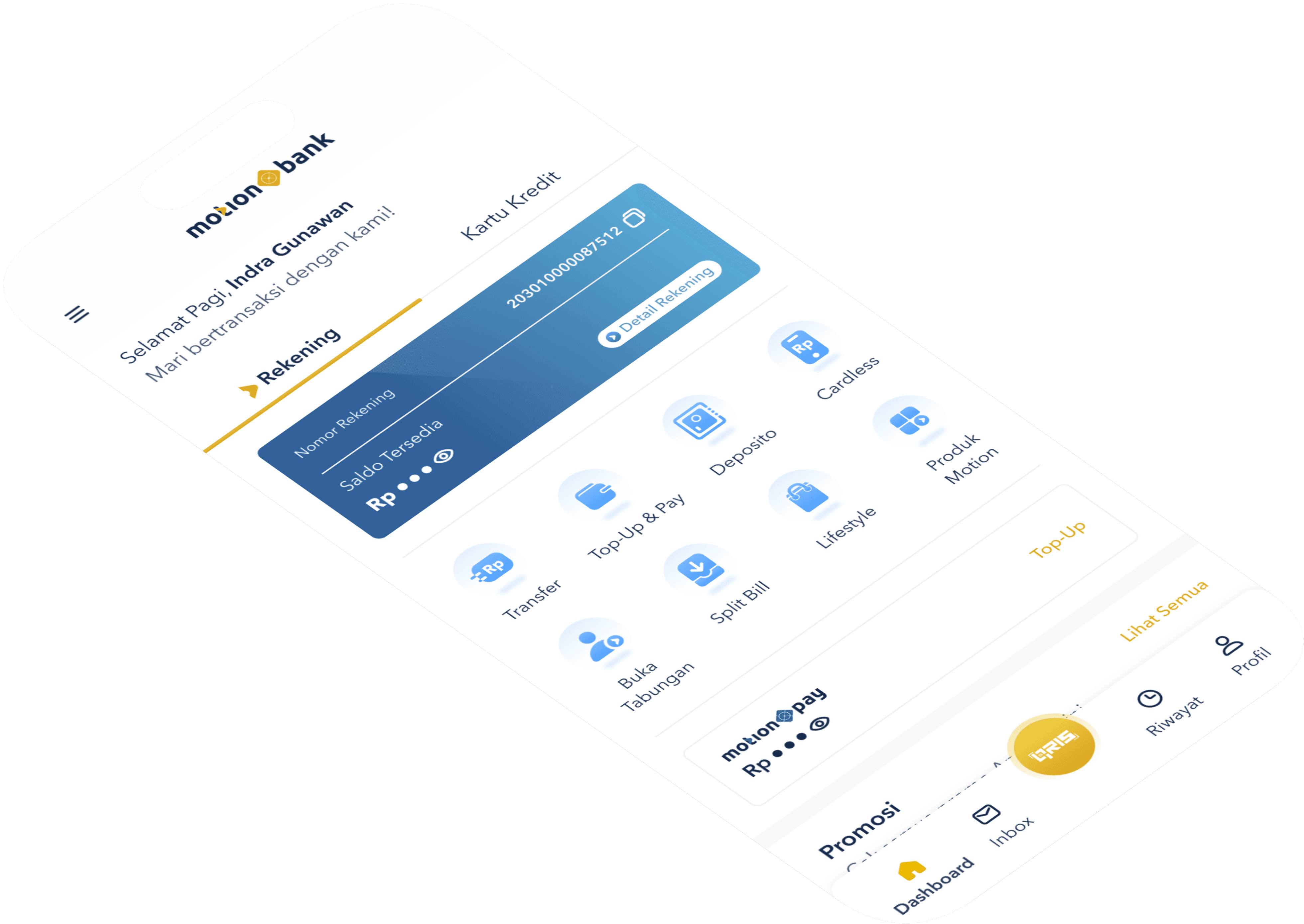
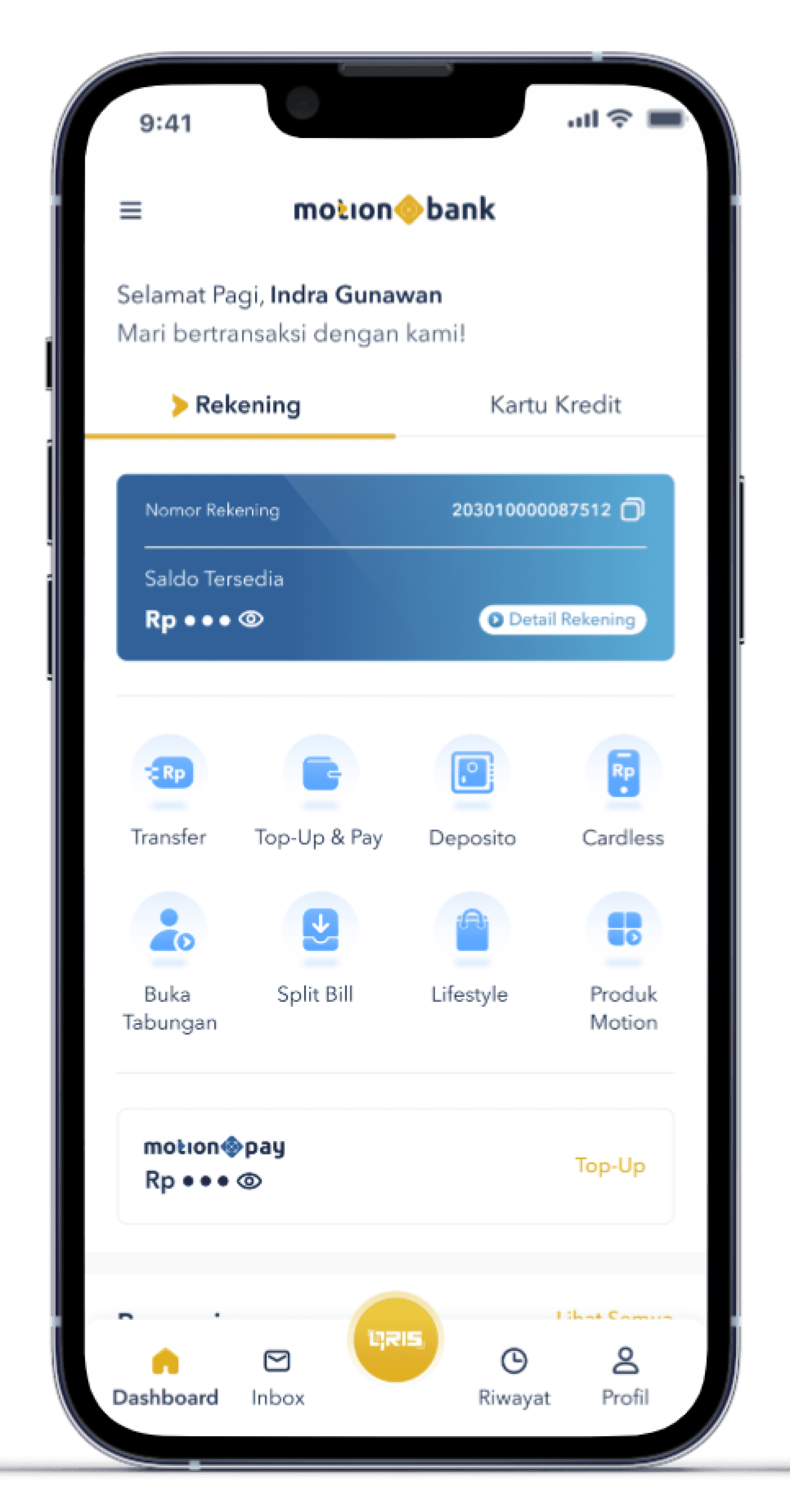
In 2022, I started working at MNC Bank and joined the UI-UX Design team responsible for a User Interfaces digital banking product called MotionBanking. That year, MotionBanking had just launched a new look of Homepage, where I played a role in providing ideas to refresh the icons.
MotionBanking was first launched in 2020, where the series of icons that existed since first launched helped Users understand the experiences. However, I have a responsibility to revamp them by adapting to the evolution of MotionBanking's visual language.
Approach Problem
To revamp the series of icons, I collaborated with Teddy Rian Naldy, a UI/UX Designer MotionBanking who designed the icon design system. To define the problem, we collected and analyzed the existing icons.
Strokes and icon structure are too thin
Furthermore, I analyzed strokes and structure based on several things:
The strokes and the shape of existing icons are not consistent.
In the evolution of visual language over the last few years, I audited the existing MotionBanking design and found that it was increasingly replacing text-based buttons with icons and making them more stand out in the User Interface Design
The old User Interface increases size and strokes of texts that makes the icon appear not feasible.
I also see an opportunity in increasing readability on icons when they are on different backgrounds.
Most importantly, I also improve the readability of the icons, especially when they are on the front of the layers of different backgrounds.
The old design had several different sets of icons to combine
MotionBank has no guidelines for designing icons, and team members can not follow the rules. It must be a big problem for the team and the experience. So, I decided to build a new icon guideline for them. The guidelines help the team design icons, and the result icon can be consistent and accessible for the team to manage their designs.
Creating and managing icons are not simple
I simplified our icon guidelines in general. One key aspect was building the team's tool shift to Figma from Sketch. The process was creating design source files. Given these guidelines, another way is to reduce the icon sizes and add each icon to the system.
Creating a smooth transition for users
I want this update to be a smooth transition for users. For most of the icons, I kept the current pattern of the icon. For this reason, users can still find their way but can also enjoy the new icon style.
What's new?
Along with the overall refresh, the main difference is that I fine-tuned the shape and thickness of the icons. After that, I increased the thickness of the icon by changing the size inconsistent with the design, switching from 1px to 2px with an icon size of 24px.
Before
After
Two bolder sizes: 24 & 16px
I added thickness to the icons and simplified the icon guidelines with icons in these two sizes:
24px uses a 2-pixel thickness (considered our primary/default size)
16px uses a thickness of 1.5 pixels
Other sizes are required by adjusting the scale of this size.
The result is a balanced and more straightforward scanning of the collection of icons and typography.
16x16px
1.5px stroke
2px stroke
24x25px
Before
After
More fresh to look
I drew each icon in a new style with a bolder one. Most icons still maintain their previous functionality.
Before
After
Different filled states
To improve the clarity of icons, the filled state is no longer used, and there is a slight change in thickness but instead filling part of the icon.
Before
After
How to Do?
Collaborating with Teddy Ryanaldi
Teddy is responsible for all the designs in MotionBanking. Teddy and I communicated diligently for several months to achieve a close and successful collaboration.
Identifies the thickness of the new icon
One of the critical steps in this process is determining the thickness of the icons we will use next. Previously, Teddy used a stroke thickness of 1px and no guidelines at all.
The more we dare to move away from the old design, the more we can see clear improvements and developments. After several iterations, there are two new thicknesses that we should improve. This decision bring us to two main aspects:
To meet the goals for this project, the new thickness had to look bolder than before. With 1.5px and 2px, I increased the stroke thickness by 50% for the 16px size and 100% for the 24px size.
The new thickness should be easy to design when creating new icons, which means staying as close as possible to whole-pixel or half-pixel values, which designers find more accessible and faster to work with.
Create icon guideline access simply with Figma
Another big focus is bringing as many contributions to the new icon as possible into Figma, as it is now the default icon in MotionBank Design, with the breakthrough being:
We document the entire process of creating icons on Figma
The guidelines show all the guides on following the new structure and visual style.
As the team creates icons, I encourage them to keep exploring by staying within the established rules.
Collaborate with the Front-End team on new icon integration.
What's Next?
We're excited for everyone to experience the updated icon in the MotionBank app, and users are seeing it on the platform gradually throughout the year.